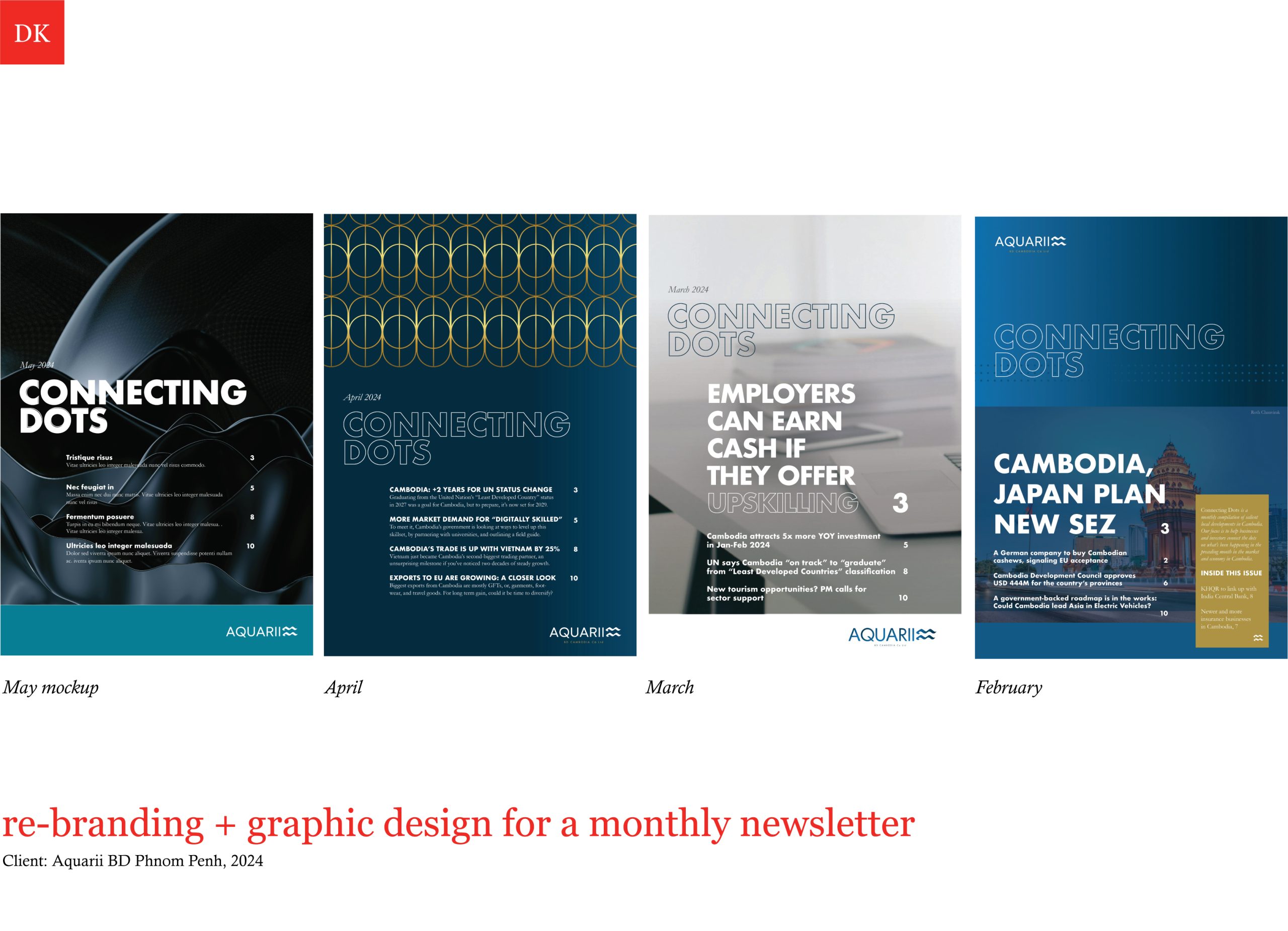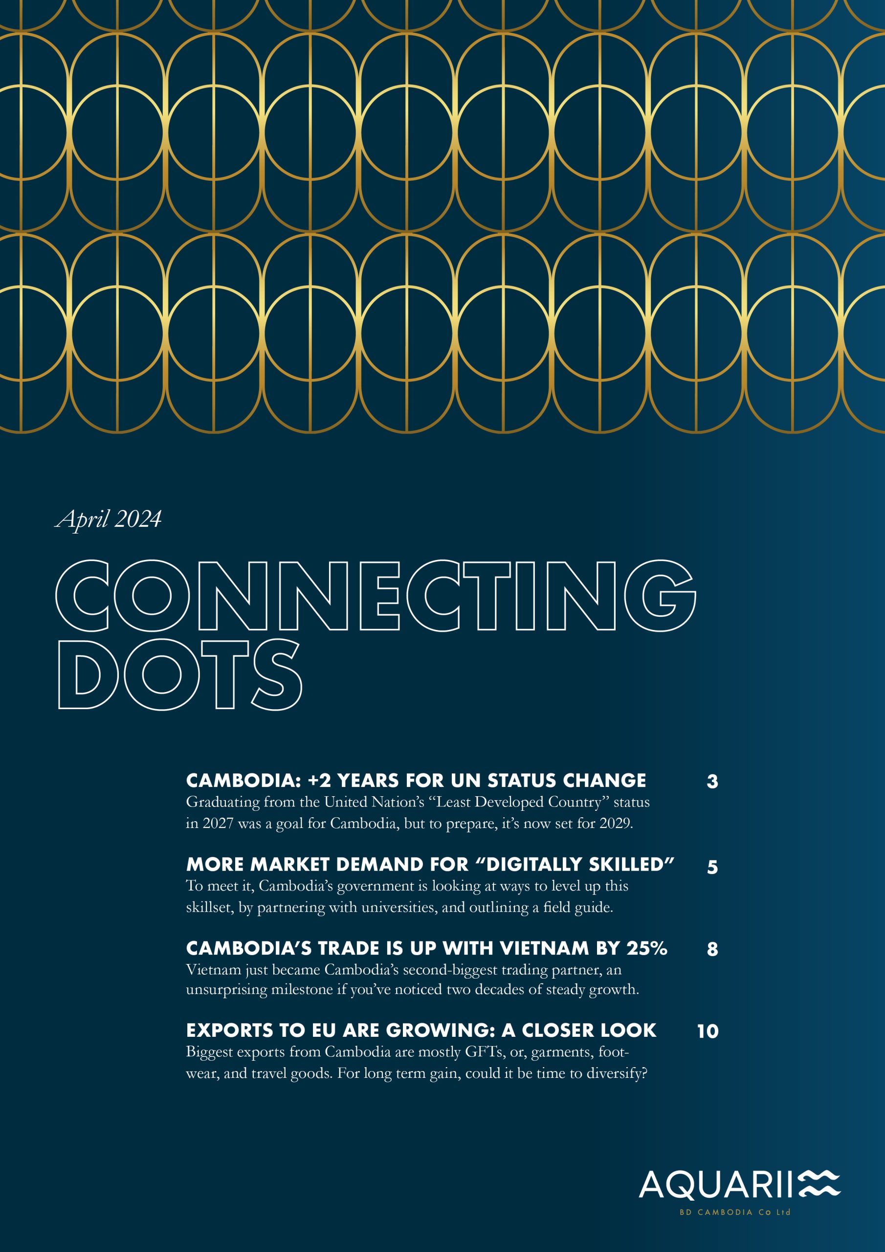
DK redesigned a newsletter template for Aquarii BD, a Phnom Penh-based startup.
Design brief
The design goal was to make the salient points of local updates crystal clear for an international, business investor audience.
Design Kompany’s role was to re-imagine the way our client was presenting information. Information that was hard to parse for those not already familiar with the lay of the land and business climate of Cambodia, more specifically.
How to isolate and shape news that was credible for people to read, in a way that was easy on the eye, easy to process, and easy to understand for people who may not have English as a first language? These were the challenges.
With Dipika Kohli’s background in journalism in the US with a business newspaper there, plus a newspaper redesign project already under our belt at Design Kompany, too, it was possible. What we could do was to add the kind of editorial expertise that is required exactly for this purpose. someone who has been through many newspapers and examined them for style, content, tone, and overall aesthetic presentation. What do people take seriously? Quality: competently created, accurate, clear and visually appealing graphics make it pop out. For a marketing communications tool, a topnotch design is imperative. That’s where we came in.
Make the data data easy to understand, give context, and go easy on the eye
Smart design doesn’t have to be complicated or overdone. It’s best if you can take tons of information and distill the essence to a tight, clear concept. Then show that through words and image. Publishing is an art and we are so very excited when we are part of the process to design, and co-design, something new like this.
Over the course of three months, we built new templates on Illustrator and edited and laid out text that the company provided to us. What are the salient points? Are they being communicated clearly? We worked with five people over the course of the time that we were a third-party member of the newsletter team. We hosted editorial meetings to call to attention areas where text could be more precise, or more compelling. This was a chance to also show how to think about what information is important to ‘put at the top’, before people lose interest. Full-time newswriting and newsroom experiences that Kohli has had before with what used to be called West Cork Advertiser in West Cork and the Seattle Daily Journal of Commerce in that city helped her prepare the handouts for the team to use to try things out, themselves.
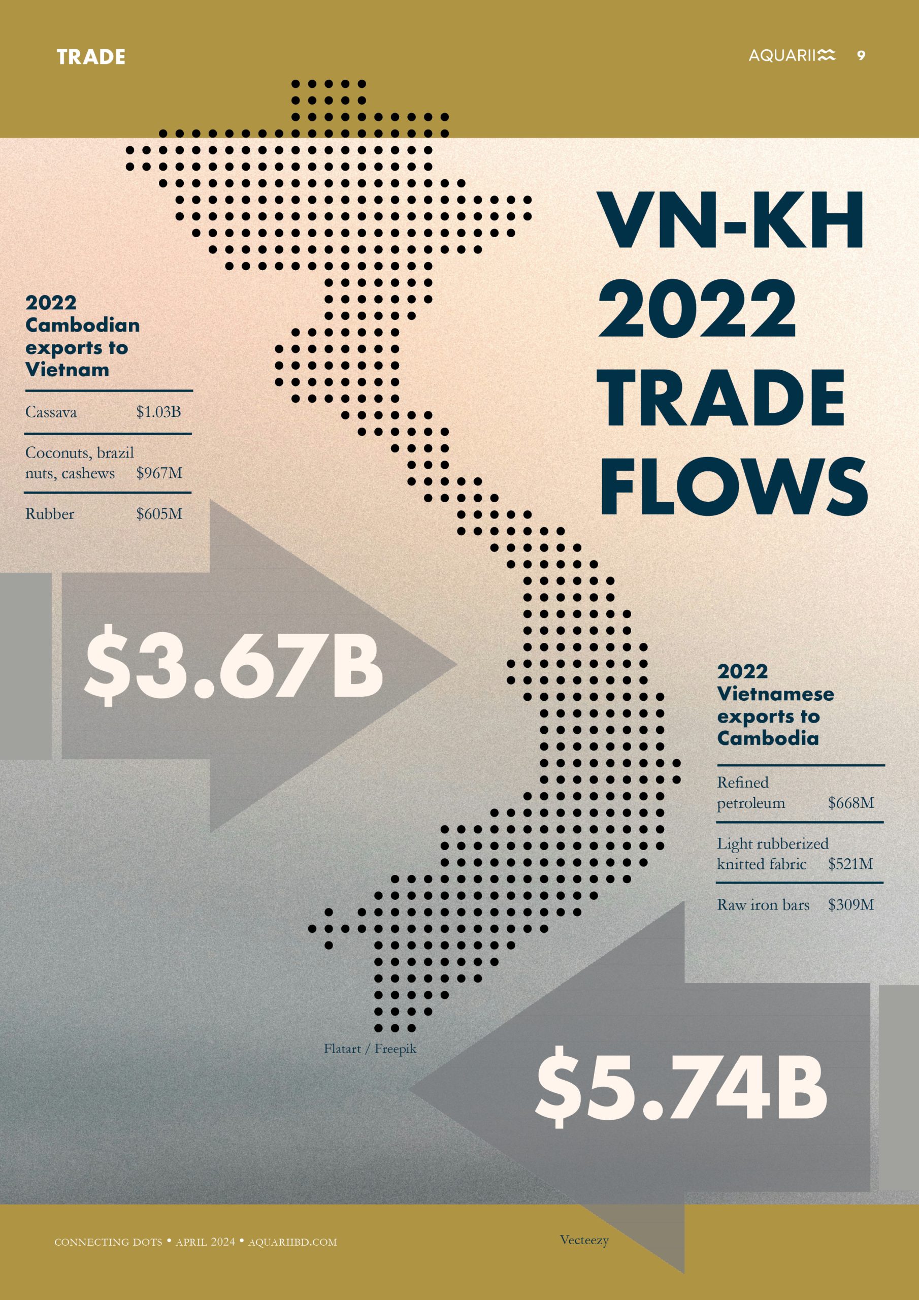
Below is one example of making the data received something that a reader could scan through easily and not lose sight of the salient points of the story.
Design is about clear communication
Much of the information you get that is made in Cambodia is difficult to suss, because of many reasons. So if something is credible, that is, has been vetted and is believable and based on real data, it’s something people take note of.
For us, making the visuals convey credibility was key. In the above example image, the goal was to elaborate on what might pop up in the minds of readers? What was being traded and, at what volume, and, in which directions?
DK’s role was to encourage the team to think about how to add more to the superficial layers. That’s how this project made use of DK’s background in business newswriting. With meetings for specifically calling out editorial insights, the team had time to think more deeply about what they wanted to talk about in their newsletter.
DK made templates, infographics, layouts, and also did editing for a consistent, streamlined ‘look and feel.’ A design goal was to build templates and work with the team to create copy-edited pieces for believability’. Trustbuilding starts with clear design and consistency, over time, to create the reliability that is required for people to gain confidence in the value of a brand.